" width="21.999999753710938px"><path d="M 6.439 4.688 L 5.707 4.686 L 5.707 1.596 L 6.439 1.596 Z M 11.568 4.141 C 12.098 4.139 12.528 3.688 12.526 3.131 C 12.526 2.583 12.098 2.134 11.562 2.134 C 11.027 2.134 10.598 2.583 10.598 3.131 L 10.598 3.137 C 10.602 3.694 11.032 4.143 11.564 4.141 Z M 13.224 3.132 C 13.224 4.094 12.481 4.873 11.563 4.873 C 10.645 4.873 9.902 4.094 9.902 3.132 C 9.902 2.17 10.647 1.405 11.565 1.405 C 12.483 1.405 13.224 2.183 13.224 3.132 Z M 3.8 4.689 L 3.801 4.689 L 3.801 4.69 Z M 3.801 4.689 L 3.799 2.742 C 3.799 2.401 3.567 2.17 3.218 2.17 C 2.869 2.17 2.626 2.401 2.626 2.742 L 2.626 4.69 L 1.904 4.69 L 1.904 2.742 C 1.904 2.401 1.661 2.17 1.324 2.17 C 0.965 2.17 0.732 2.401 0.732 2.742 L 0.732 4.689 L 0 4.687 L 0 1.621 L 0.732 1.621 L 0.732 1.828 C 0.942 1.56 1.244 1.403 1.604 1.403 C 1.848 1.403 2.15 1.501 2.406 1.756 C 2.649 1.501 2.928 1.415 3.265 1.415 C 3.777 1.415 4.52 1.767 4.52 2.765 L 4.52 4.689 Z M 9.357 2.196 L 8.926 2.268 C 8.566 2.34 8.333 2.537 8.333 2.962 L 8.333 4.689 L 7.601 4.689 L 7.601 2.852 C 7.601 1.928 8.123 1.66 8.925 1.465 L 9.356 1.405 Z M 6.404 0.137 C 6.579 0.322 6.579 0.621 6.404 0.807 L 6.397 0.814 C 6.215 1.001 5.921 0.999 5.742 0.807 C 5.568 0.62 5.568 0.324 5.742 0.137 C 5.928 -0.046 6.217 -0.046 6.404 0.137 Z" fill="rgb(5, 0, 56)" height="4.872677770887237px" id="hklzcLOz0" transform="translate(8.776 1.269)" width="13.22437134044651px"/><path d="M 1.654 0 L 5.981 0 C 6.894 0 7.635 0.776 7.635 1.733 L 7.635 6.267 C 7.635 7.224 6.894 8 5.981 8 L 1.654 8 C 0.741 8 0 7.224 0 6.267 L 0 1.733 C 0 0.776 0.741 0 1.654 0 Z" fill="rgb(255, 208, 47)" height="8px" id="PRQZmCFo6" transform="translate(0 0)" width="7.635337318544202px"/><path d="M 4.191 0.001 L 3.353 0.001 L 4.051 1.287 L 2.515 0.001 L 1.677 0.001 L 2.445 1.573 L 0.838 0.001 L 0 0.001 L 0.838 2.001 L 0 6.002 L 0.838 6.002 L 2.445 1.715 L 1.677 6.002 L 2.515 6.002 L 4.051 1.43 L 3.353 6.002 L 4.191 6.002 L 5.728 0.999 L 4.191 0 Z" fill="rgb(5, 0, 56)" height="6.002087269083345px" id="MAraoXwt_" transform="translate(1.114 0.999)" width="5.7276983047968315px"/></g></svg>)
"/><stop offset="1" stop-color="rgba(255, 255, 0, 0)"/></linearGradient><linearGradient id="WZ06ztwqU-1384632245-linear-gradient" x1="0" x2="1" y1="0.7841478548440265" y2="0.2158521451559735"><stop offset="0" stop-color="rgb(0, 255, 255)"/><stop offset="1" stop-color="rgba(0, 255, 255, 0)"/></linearGradient><linearGradient id="NUexHgH2L-1384632245-linear-gradient" x1="0.49751243781094523" x2="0.5024875621890548" y1="0" y2="1"><stop offset="0" stop-color="rgb(255, 0, 255)"/><stop offset="1" stop-color="rgba(255, 0, 255, 0)"/></linearGradient><linearGradient id="hAPwmisWX-1384632245-linear-gradient" x1="5.551115123125783e-17" x2="1" y1="0.09342643387430183" y2="0.9065735661256982"><stop offset="0" stop-color="rgb(52, 52, 52)"/><stop offset="1" stop-color="rgb(77, 77, 77)"/></linearGradient><linearGradient id="qquvBnN2E-1384632245-linear-gradient" x1="1" x2="0" y1="0.5016011218987045" y2="0.49839887810129546"><stop offset="0" stop-color="rgb(85, 150, 234)"/><stop offset="1" stop-color="rgba(85, 150, 234, 0)"/></linearGradient></defs><g d="M 0.738 4.125 C 0.738 1.987 2.471 0.254 4.609 0.254 C 6.746 0.254 8.479 1.987 8.479 4.125 C 8.479 6.262 6.746 7.995 4.609 7.995 C 2.471 7.995 0.738 6.262 0.738 4.125 Z M 0.675 4.067 C 0.675 1.895 2.436 0.134 4.609 0.134 C 6.781 0.134 8.542 1.895 8.542 4.067 C 8.542 6.239 6.781 8 4.609 8 C 2.436 8 0.675 6.239 0.675 4.067 Z M 0.738 3.873 C 0.738 1.735 2.471 0.002 4.609 0.002 C 6.746 0.002 8.479 1.735 8.479 3.873 C 8.479 6.011 6.746 7.743 4.609 7.743 C 2.471 7.743 0.738 6.011 0.738 3.873 Z M 0.738 3.873 C 0.738 1.735 2.471 0.002 4.609 0.002 C 6.746 0.002 8.479 1.735 8.479 3.873 C 8.479 6.011 6.746 7.743 4.609 7.743 C 2.471 7.743 0.738 6.011 0.738 3.873 Z M 0.738 3.873 C 0.738 1.735 2.471 0.002 4.609 0.002 C 6.746 0.002 8.479 1.735 8.479 3.873 C 8.479 6.011 6.746 7.743 4.609 7.743 C 2.471 7.743 0.738 6.011 0.738 3.873 Z M 0.738 3.873 C 0.738 1.735 2.471 0.002 4.609 0.002 C 6.746 0.002 8.479 1.735 8.479 3.873 C 8.479 6.011 6.746 7.743 4.609 7.743 C 2.471 7.743 0.738 6.011 0.738 3.873 Z M 1.829 1.186 C 1.605 1.417 1.411 1.674 1.251 1.953 C 1.817 2.507 2.426 3.094 2.675 3.362 C 3.096 3.815 3.973 4.477 4.611 4.401 C 4.864 4.578 5.435 4.976 5.627 5.07 C 5.623 5.162 5.642 5.254 5.674 5.347 C 5.853 5.848 6.523 6.174 6.133 6.709 C 6.901 6.243 7.105 5.467 6.78 4.913 C 6.577 4.568 6.282 4.454 6.036 4.537 C 5.888 4.37 5.303 3.884 5.087 3.706 C 4.949 3.087 4.115 2.45 3.584 2.172 C 3.259 2.003 2.516 1.585 1.83 1.186 L 1.83 1.186 Z M 5.093 4.174 C 4.473 4.752 3.28 3.835 2.776 3.258 C 2.258 2.665 0.324 0.666 0.183 0.536 C 0.042 0.407 -0.071 0.247 0.054 0.087 C 0.185 -0.068 0.364 0.009 0.52 0.121 C 0.676 0.233 3.032 1.712 3.719 2.097 C 4.388 2.47 5.531 3.448 5.093 4.174 Z M 6.088 4.745 C 3.668 6.904 1.689 4.835 1.382 4.118 C 1.563 5.362 2.402 6.475 3.668 6.903 C 4.624 7.227 6.151 7.219 6.835 5.987 L 6.088 4.744 Z M 6.078 4.949 C 5.88 5.04 5.902 5.105 5.727 5.077 C 5.605 5.057 4.557 4.262 4.557 4.262 C 4.504 4.134 4.567 3.96 4.687 3.821 C 4.798 3.675 4.957 3.577 5.092 3.602 C 5.092 3.602 6.086 4.465 6.131 4.579 C 6.194 4.745 6.126 4.738 6.078 4.95 L 6.078 4.95 Z M 6.132 6.707 C 6.913 6.265 7.14 5.495 6.832 4.932 C 6.592 4.495 6.199 4.412 5.927 4.624 C 5.657 4.833 5.633 5.084 5.714 5.332 C 5.878 5.839 6.539 6.185 6.133 6.708 Z M 10.031 1.536 C 10.201 1.512 10.374 1.525 10.544 1.52 C 10.546 2.226 10.543 2.932 10.546 3.638 C 10.931 2.949 11.298 2.249 11.676 1.557 C 11.855 1.527 12.043 1.486 12.221 1.538 C 12.298 1.556 12.303 1.646 12.26 1.7 C 11.883 2.353 11.502 3.004 11.125 3.657 C 11.41 3.879 11.617 4.185 11.77 4.509 C 12.03 5.068 12.161 5.677 12.254 6.283 C 12.262 6.346 12.283 6.448 12.199 6.469 C 12.011 6.495 11.819 6.481 11.63 6.465 C 11.548 6.026 11.454 5.587 11.322 5.16 C 11.223 4.839 11.086 4.523 10.865 4.266 C 10.781 4.16 10.666 4.088 10.545 4.03 C 10.543 4.802 10.545 5.573 10.543 6.346 C 10.549 6.395 10.527 6.46 10.467 6.459 C 10.3 6.479 10.132 6.469 9.964 6.473 C 9.963 4.875 9.964 3.278 9.964 1.68 C 9.965 1.628 9.96 1.545 10.03 1.536 M 13.322 1.681 C 13.322 1.625 13.32 1.545 13.387 1.527 C 13.61 1.511 13.833 1.526 14.056 1.52 C 14.403 1.514 14.783 1.557 15.057 1.791 C 15.312 2.012 15.4 2.362 15.425 2.687 C 15.449 3.062 15.427 3.452 15.272 3.799 C 15.179 4.009 15.02 4.185 14.822 4.302 C 15.253 4.892 15.44 5.625 15.484 6.346 C 15.492 6.403 15.459 6.466 15.397 6.472 C 15.22 6.491 15.041 6.479 14.864 6.472 C 14.812 5.774 14.702 5.04 14.284 4.458 C 14.152 4.461 14.021 4.464 13.89 4.462 C 13.887 5.079 13.886 5.697 13.89 6.315 C 13.89 6.366 13.89 6.449 13.822 6.456 C 13.657 6.479 13.489 6.469 13.323 6.473 C 13.322 4.875 13.323 3.278 13.323 1.681 M 13.889 2.024 C 13.883 2.661 13.888 3.297 13.889 3.933 C 14.11 3.925 14.364 3.976 14.546 3.818 C 14.758 3.629 14.783 3.322 14.801 3.055 C 14.808 2.76 14.815 2.429 14.629 2.181 C 14.445 1.964 14.137 2.035 13.888 2.023 M 16.475 1.556 C 16.642 1.51 16.817 1.526 16.989 1.52 C 16.989 3.118 16.989 4.715 16.989 6.314 C 16.987 6.362 16.994 6.434 16.934 6.453 C 16.761 6.482 16.584 6.467 16.409 6.472 C 16.409 4.908 16.409 3.344 16.409 1.781 C 16.414 1.704 16.409 1.609 16.475 1.555 M 17.907 1.587 C 17.926 1.518 18.008 1.52 18.066 1.52 C 18.852 1.521 19.638 1.52 20.425 1.52 C 20.423 1.663 20.429 1.806 20.423 1.95 C 20.429 2.012 20.373 2.064 20.312 2.057 C 20.02 2.061 19.728 2.057 19.436 2.059 C 19.433 3.488 19.436 4.918 19.435 6.348 C 19.436 6.392 19.423 6.447 19.372 6.455 C 19.204 6.479 19.032 6.469 18.863 6.473 C 18.863 5.002 18.863 3.531 18.863 2.059 C 18.543 2.059 18.222 2.059 17.902 2.059 C 17.905 1.903 17.893 1.744 17.908 1.588 M 21.839 1.629 C 21.85 1.583 21.869 1.536 21.916 1.52 C 22.052 1.504 22.189 1.516 22.325 1.516 C 22.746 3.129 23.169 4.742 23.588 6.356 C 23.617 6.418 23.558 6.474 23.498 6.475 C 23.335 6.488 23.17 6.481 23.006 6.474 C 22.907 6.053 22.808 5.632 22.709 5.212 C 22.299 5.212 21.888 5.212 21.478 5.212 C 21.385 5.591 21.299 5.971 21.206 6.349 C 21.195 6.403 21.166 6.463 21.105 6.471 C 20.931 6.493 20.755 6.48 20.581 6.466 C 20.999 4.854 21.42 3.242 21.838 1.629 M 21.6 4.697 C 21.927 4.696 22.255 4.7 22.582 4.695 C 22.402 3.913 22.179 3.138 22.098 2.337 C 21.987 3.134 21.783 3.914 21.6 4.697" fill="transparent" height="8px" id="m_xT95mO6" width="23.595709450331594px"><g d="M 0.063 3.991 C 0.063 1.853 1.796 0.12 3.933 0.12 C 6.071 0.12 7.804 1.853 7.804 3.991 C 7.804 6.129 6.071 7.861 3.933 7.861 C 1.796 7.861 0.063 6.129 0.063 3.991 Z M 0 3.933 C 0 1.761 1.761 0 3.933 0 C 6.105 0 7.866 1.761 7.866 3.933 C 7.866 6.105 6.105 7.866 3.933 7.866 C 1.761 7.866 0 6.105 0 3.933 Z" fill="transparent" height="7.866370050993293px" id="rqODBROjn" transform="translate(0.675 0.134)" width="7.866370052565429px"><path d="M 0 3.87 C 0 1.733 1.733 0 3.87 0 C 6.008 0 7.741 1.733 7.741 3.87 C 7.741 6.008 6.008 7.741 3.87 7.741 C 1.733 7.741 0 6.008 0 3.87 Z" fill="transparent" height="7.7409569770878655px" id="kIEDfwci5" transform="translate(0.063 0.12)" width="7.740956977087762px"/><path d="M 0 3.933 C 0 1.761 1.761 0 3.933 0 C 6.105 0 7.866 1.761 7.866 3.933 C 7.866 6.105 6.105 7.866 3.933 7.866 C 1.761 7.866 0 6.105 0 3.933 Z" fill="rgb(0, 0, 0)" height="7.8663700511144405px" id="BJe_Cf9pD" transform="translate(0 0)" width="7.866370051114359px"/></g><path d="M 0 3.87 C 0 1.733 1.733 0 3.87 0 C 6.008 0 7.741 1.733 7.741 3.87 C 7.741 6.008 6.008 7.741 3.87 7.741 C 1.733 7.741 0 6.008 0 3.87 Z" fill="rgb(255, 255, 255)" height="7.740956977087862px" id="IZy63ih6v" transform="translate(0.738 0.002)" width="7.740956977087876px"/><path d="M 0 3.87 C 0 1.733 1.733 0 3.87 0 C 6.008 0 7.741 1.733 7.741 3.87 C 7.741 6.008 6.008 7.741 3.87 7.741 C 1.733 7.741 0 6.008 0 3.87 Z" fill="url(%23IanJMfEJG-1384632245-linear-gradient)" height="7.740956977087862px" id="IanJMfEJG" transform="translate(0.738 0.002)" width="7.740956977087876px"/><path d="M 0 3.87 C 0 1.733 1.733 0 3.87 0 C 6.008 0 7.741 1.733 7.741 3.87 C 7.741 6.008 6.008 7.741 3.87 7.741 C 1.733 7.741 0 6.008 0 3.87 Z" fill="url(%23WZ06ztwqU-1384632245-linear-gradient)" height="7.740956977087862px" id="WZ06ztwqU" transform="translate(0.738 0.002)" width="7.740956977087876px"/><path d="M 0 3.87 C 0 1.733 1.733 0 3.87 0 C 6.008 0 7.741 1.733 7.741 3.87 C 7.741 6.008 6.008 7.741 3.87 7.741 C 1.733 7.741 0 6.008 0 3.87 Z" fill="url(%23NUexHgH2L-1384632245-linear-gradient)" height="7.740956977087862px" id="NUexHgH2L" transform="translate(0.738 0.002)" width="7.740956977087876px"/><path d="M 0.578 0 C 0.354 0.231 0.16 0.488 0 0.767 C 0.566 1.321 1.175 1.908 1.424 2.177 C 1.845 2.63 2.721 3.291 3.36 3.215 C 3.612 3.393 4.184 3.79 4.375 3.885 C 4.371 3.976 4.39 4.068 4.422 4.161 C 4.602 4.663 5.271 4.988 4.882 5.523 C 5.649 5.058 5.854 4.281 5.529 3.728 C 5.326 3.382 5.031 3.268 4.785 3.351 C 4.637 3.185 4.051 2.698 3.836 2.521 C 3.698 1.902 2.864 1.264 2.333 0.987 C 2.007 0.818 1.265 0.399 0.578 0.001 L 0.578 0.001 Z" fill="rgb(0, 0, 0)" height="5.523125773249436px" id="cpw87b9OX" transform="translate(1.251 1.186)" width="5.677590956387689px"/><path d="M 5.093 4.174 C 4.473 4.752 3.28 3.835 2.776 3.258 C 2.258 2.665 0.324 0.666 0.183 0.536 C 0.042 0.407 -0.071 0.247 0.054 0.087 C 0.185 -0.068 0.364 0.009 0.52 0.121 C 0.676 0.233 3.032 1.712 3.719 2.097 C 4.388 2.47 5.531 3.448 5.093 4.174 Z" fill="url(%23hAPwmisWX-1384632245-linear-gradient)" height="4.358221849339678px" id="hAPwmisWX" transform="translate(0 0)" width="5.19036851608308px"/><path d="M 4.706 0.627 C 2.286 2.786 0.307 0.717 0 0 C 0.182 1.244 1.02 2.357 2.286 2.785 C 3.243 3.109 4.769 3.101 5.453 1.869 L 4.706 0.626 Z" fill="url(%23qquvBnN2E-1384632245-linear-gradient)" height="2.965526377659145px" id="qquvBnN2E" transform="translate(1.382 4.118)" width="5.452993462116183px"/><path d="M 1.54 1.351 C 1.342 1.441 1.364 1.507 1.189 1.478 C 1.067 1.459 0.019 0.664 0.019 0.664 C -0.034 0.536 0.029 0.361 0.149 0.223 C 0.261 0.077 0.419 -0.022 0.554 0.004 C 0.554 0.004 1.548 0.866 1.593 0.981 C 1.657 1.147 1.588 1.139 1.54 1.351 L 1.54 1.351 Z" fill="rgb(191, 191, 191)" height="1.4850633759023049px" id="u7V8OSMwi" transform="translate(4.538 3.598)" width="1.6187035774402256px"/><path d="M 0.458 2.195 C 1.24 1.753 1.467 0.983 1.159 0.42 C 0.919 -0.017 0.525 -0.1 0.254 0.112 C -0.016 0.321 -0.04 0.572 0.041 0.82 C 0.205 1.327 0.865 1.673 0.459 2.196 Z" fill="rgb(40, 40, 40)" height="2.1957611574985076px" id="S_suy5qt_" transform="translate(5.673 4.512)" width="1.2911986754486042px"/><path d="M 0.067 0.023 C 0.237 -0.001 0.41 0.012 0.58 0.007 C 0.582 0.713 0.579 1.419 0.582 2.125 C 0.967 1.436 1.334 0.736 1.712 0.044 C 1.891 0.014 2.079 -0.027 2.257 0.025 C 2.335 0.043 2.339 0.133 2.296 0.187 C 1.919 0.84 1.538 1.491 1.161 2.144 C 1.446 2.366 1.653 2.672 1.806 2.996 C 2.066 3.555 2.197 4.163 2.29 4.77 C 2.298 4.833 2.319 4.935 2.235 4.956 C 2.047 4.982 1.855 4.968 1.666 4.952 C 1.584 4.513 1.49 4.074 1.358 3.647 C 1.259 3.326 1.122 3.01 0.901 2.753 C 0.817 2.647 0.702 2.575 0.581 2.517 C 0.58 3.289 0.581 4.06 0.58 4.833 C 0.585 4.882 0.563 4.946 0.503 4.946 C 0.336 4.965 0.168 4.956 0 4.96 C 0 3.362 0 1.765 0 0.167 C 0.001 0.115 -0.004 0.031 0.066 0.023" fill="rgb(0, 0, 0)" height="4.970462433445695px" id="SJ7XJieH7" transform="translate(9.964 1.513)" width="2.323345449951815px"/><path d="M 0 0.162 C 0 0.105 -0.002 0.026 0.065 0.008 C 0.288 -0.008 0.512 0.006 0.734 0.001 C 1.082 -0.005 1.461 0.038 1.735 0.272 C 1.991 0.493 2.078 0.843 2.103 1.168 C 2.127 1.543 2.106 1.933 1.951 2.28 C 1.857 2.49 1.698 2.666 1.501 2.783 C 1.932 3.373 2.118 4.106 2.163 4.827 C 2.17 4.884 2.137 4.947 2.076 4.953 C 1.899 4.972 1.719 4.96 1.542 4.953 C 1.49 4.255 1.38 3.52 0.962 2.939 C 0.831 2.942 0.7 2.945 0.568 2.943 C 0.565 3.56 0.564 4.178 0.568 4.796 C 0.568 4.847 0.568 4.93 0.5 4.937 C 0.335 4.959 0.167 4.95 0.002 4.954 C 0.001 3.356 0.002 1.759 0.002 0.162 M 0.568 0.505 C 0.562 1.142 0.566 1.778 0.568 2.414 C 0.788 2.406 1.043 2.457 1.224 2.299 C 1.436 2.11 1.461 1.803 1.479 1.536 C 1.486 1.241 1.493 0.91 1.307 0.662 C 1.124 0.445 0.815 0.516 0.567 0.504" fill="rgb(0, 0, 0)" height="4.9631616938146195px" id="wKghw8vNE" transform="translate(13.322 1.519)" width="2.163586800820636px"/><path d="M 0.066 0.036 C 0.233 -0.01 0.408 0.006 0.58 0 C 0.58 1.598 0.58 3.196 0.58 4.794 C 0.578 4.842 0.585 4.914 0.525 4.933 C 0.351 4.962 0.175 4.947 0 4.952 C 0 3.389 0 1.824 0 0.261 C 0.005 0.184 0 0.089 0.066 0.035" fill="rgb(0, 0, 0)" height="4.952166252023165px" id="gvF_lhmyZ" transform="translate(16.409 1.52)" width="1px"/><path d="M 0.007 0.068 C 0.025 -0.002 0.108 0 0.166 0 C 0.952 0.001 1.738 0 2.525 0 C 2.523 0.144 2.529 0.286 2.523 0.43 C 2.529 0.492 2.473 0.544 2.412 0.537 C 2.12 0.541 1.828 0.537 1.536 0.539 C 1.533 1.969 1.536 3.399 1.535 4.828 C 1.536 4.872 1.523 4.927 1.472 4.936 C 1.304 4.96 1.132 4.949 0.963 4.953 C 0.963 3.482 0.963 2.011 0.963 0.54 C 0.643 0.54 0.322 0.54 0.002 0.54 C 0.005 0.383 -0.008 0.224 0.008 0.068" fill="rgb(0, 0, 0)" height="4.952994747482833px" id="xV0xadM_i" transform="translate(17.9 1.52)" width="2.5256442517703683px"/><path d="M 1.258 0.117 C 1.269 0.072 1.289 0.024 1.336 0.008 C 1.471 -0.008 1.608 0.005 1.744 0.004 C 2.165 1.617 2.588 3.23 3.007 4.844 C 3.036 4.907 2.978 4.962 2.918 4.963 C 2.754 4.976 2.589 4.969 2.425 4.962 C 2.326 4.541 2.227 4.12 2.128 3.7 C 1.718 3.7 1.308 3.7 0.898 3.7 C 0.804 4.079 0.718 4.459 0.625 4.837 C 0.615 4.892 0.586 4.951 0.525 4.959 C 0.351 4.981 0.174 4.968 0 4.954 C 0.418 3.342 0.839 1.73 1.257 0.117 M 1.019 3.185 C 1.347 3.184 1.674 3.189 2.002 3.183 C 1.822 2.402 1.598 1.626 1.517 0.826 C 1.406 1.623 1.202 2.402 1.019 3.185" fill="rgb(0, 0, 0)" height="4.97090175630817px" id="c5S8USemp" transform="translate(20.581 1.512)" width="3.0150324178608843px"/></g></svg>)
" width="39.31443931830528px"><path d="M 1.367 0 C 0.558 0 0 0.554 0 1.391 L 0 4.3 C 0 5.135 0.547 5.696 1.367 5.696 C 2.186 5.696 2.75 5.137 2.75 4.3 L 2.75 1.391 C 2.75 0.558 2.175 0 1.367 0 Z M 12.557 0.055 C 12.516 0.056 12.484 0.092 12.485 0.133 C 12.485 0.133 12.485 0.134 12.485 0.135 L 12.485 5.543 C 12.483 5.585 12.514 5.62 12.556 5.623 C 12.559 5.623 12.561 5.623 12.564 5.623 L 12.97 5.623 C 13.012 5.625 13.048 5.593 13.05 5.551 C 13.05 5.547 13.05 5.545 13.05 5.542 L 13.05 3.141 C 13.051 3.125 13.064 3.112 13.082 3.109 L 13.9 3.109 C 14.664 3.109 15.172 2.506 15.172 1.591 C 15.172 0.677 14.655 0.053 13.877 0.053 L 12.566 0.053 C 12.566 0.053 12.561 0.053 12.558 0.053 L 12.558 0.053 Z M 20.825 0.055 C 20.609 0.06 20.435 0.239 20.439 0.457 C 20.439 0.46 20.439 0.464 20.439 0.468 C 20.428 0.684 20.595 0.869 20.812 0.88 C 21.029 0.891 21.213 0.724 21.225 0.508 C 21.225 0.494 21.225 0.481 21.225 0.468 C 21.236 0.251 21.068 0.066 20.851 0.055 C 20.842 0.055 20.833 0.055 20.824 0.055 Z M 1.367 0.492 C 1.851 0.492 2.185 0.849 2.185 1.367 L 2.185 4.33 C 2.185 4.839 1.842 5.197 1.367 5.197 C 0.891 5.197 0.564 4.839 0.564 4.33 L 0.564 1.367 C 0.564 0.849 0.882 0.492 1.367 0.492 Z M 13.081 0.545 L 13.805 0.545 C 14.282 0.545 14.608 0.958 14.608 1.602 L 14.608 1.606 C 14.608 2.249 14.282 2.655 13.805 2.65 L 13.081 2.65 C 13.063 2.649 13.05 2.635 13.049 2.618 L 13.049 0.576 C 13.05 0.56 13.063 0.546 13.081 0.544 L 13.081 0.544 Z M 27.749 0.605 C 27.707 0.606 27.675 0.641 27.676 0.682 C 27.676 0.682 27.676 0.683 27.676 0.684 L 27.676 1.575 C 27.675 1.591 27.662 1.604 27.644 1.607 L 27.334 1.607 C 27.293 1.604 27.257 1.635 27.255 1.676 C 27.255 1.68 27.255 1.683 27.255 1.686 L 27.255 1.947 C 27.253 1.989 27.284 2.025 27.326 2.027 C 27.329 2.027 27.332 2.027 27.335 2.027 L 27.646 2.027 C 27.662 2.028 27.675 2.041 27.678 2.059 L 27.678 4.657 C 27.678 5.46 28.067 5.627 28.631 5.627 L 28.83 5.627 C 28.872 5.629 28.907 5.597 28.909 5.555 C 28.909 5.552 28.909 5.55 28.909 5.546 L 28.909 5.205 C 28.912 5.164 28.881 5.128 28.84 5.126 C 28.836 5.126 28.833 5.126 28.83 5.126 L 28.75 5.126 C 28.42 5.134 28.234 4.999 28.234 4.49 L 28.234 2.059 C 28.235 2.042 28.248 2.029 28.266 2.027 L 28.87 2.027 C 28.912 2.029 28.947 1.998 28.949 1.956 C 28.949 1.954 28.949 1.951 28.949 1.948 L 28.949 1.686 C 28.951 1.644 28.919 1.609 28.877 1.607 C 28.874 1.607 28.872 1.607 28.868 1.607 L 28.265 1.607 C 28.248 1.606 28.235 1.592 28.233 1.575 L 28.233 0.684 C 28.235 0.642 28.204 0.607 28.162 0.605 C 28.159 0.605 28.155 0.605 28.152 0.605 L 27.755 0.605 C 27.755 0.605 27.751 0.605 27.748 0.605 L 27.748 0.605 Z M 7.59 1.541 C 6.835 1.541 6.35 2.042 6.35 2.758 L 6.35 4.472 C 6.35 5.202 6.835 5.688 7.59 5.688 C 8.29 5.688 8.725 5.291 8.813 4.672 C 8.822 4.634 8.798 4.595 8.761 4.587 C 8.754 4.585 8.749 4.584 8.742 4.584 L 8.344 4.569 C 8.296 4.569 8.272 4.592 8.257 4.641 C 8.202 4.966 7.919 5.202 7.59 5.199 C 7.194 5.199 6.914 4.888 6.914 4.444 L 6.914 3.863 C 6.915 3.847 6.929 3.834 6.946 3.831 L 8.759 3.831 C 8.799 3.834 8.835 3.803 8.837 3.762 C 8.837 3.758 8.837 3.755 8.837 3.752 L 8.837 2.759 C 8.837 2.043 8.359 1.542 7.59 1.542 L 7.59 1.542 Z M 18.739 1.541 C 17.976 1.541 17.492 2.042 17.492 2.758 L 17.492 4.477 C 17.492 5.206 17.975 5.693 18.739 5.693 C 19.503 5.693 19.995 5.209 19.995 4.477 L 19.995 2.758 C 19.995 2.042 19.502 1.541 18.739 1.541 Z M 22.92 1.541 C 22.166 1.541 21.68 2.042 21.68 2.758 L 21.68 4.472 C 21.68 5.202 22.166 5.688 22.92 5.688 C 23.62 5.688 24.056 5.291 24.144 4.672 C 24.153 4.633 24.128 4.594 24.09 4.587 C 24.084 4.585 24.077 4.584 24.072 4.584 L 23.675 4.569 C 23.627 4.569 23.603 4.592 23.588 4.641 C 23.533 4.966 23.249 5.202 22.92 5.199 C 22.524 5.199 22.244 4.888 22.244 4.444 L 22.244 3.863 C 22.245 3.847 22.258 3.834 22.276 3.831 L 24.088 3.831 C 24.13 3.834 24.166 3.803 24.168 3.761 C 24.168 3.757 24.168 3.755 24.168 3.752 L 24.168 2.759 C 24.168 2.043 23.69 1.542 22.92 1.542 Z M 25.837 1.541 C 25.081 1.541 24.597 2.05 24.597 2.758 L 24.597 4.477 C 24.597 5.206 25.075 5.692 25.837 5.692 C 26.598 5.692 27.093 5.208 27.093 4.588 L 27.093 4.5 C 27.095 4.458 27.064 4.423 27.022 4.421 C 27.019 4.421 27.015 4.421 27.012 4.421 L 26.606 4.413 C 26.565 4.411 26.53 4.442 26.528 4.483 C 26.528 4.486 26.528 4.489 26.528 4.493 L 26.528 4.548 C 26.521 4.915 26.218 5.207 25.851 5.199 C 25.847 5.199 25.841 5.199 25.837 5.199 C 25.44 5.199 25.16 4.888 25.16 4.435 L 25.16 2.798 C 25.16 2.344 25.437 2.035 25.837 2.035 C 26.203 2.019 26.512 2.304 26.528 2.671 C 26.528 2.676 26.528 2.681 26.528 2.686 L 26.528 2.749 C 26.528 2.79 26.562 2.822 26.603 2.821 C 26.604 2.821 26.605 2.821 26.607 2.821 L 27.013 2.805 C 27.055 2.807 27.09 2.776 27.093 2.734 C 27.093 2.731 27.093 2.728 27.093 2.725 L 27.093 2.646 C 27.093 2.05 26.592 1.541 25.837 1.541 Z M 4.791 1.543 C 4.48 1.534 4.186 1.68 4.005 1.932 C 3.981 1.956 3.965 1.941 3.965 1.916 L 3.965 1.685 C 3.967 1.643 3.935 1.608 3.893 1.606 C 3.89 1.606 3.888 1.606 3.884 1.606 L 3.48 1.606 C 3.438 1.603 3.402 1.634 3.4 1.676 C 3.4 1.68 3.4 1.682 3.4 1.685 L 3.4 7.091 C 3.398 7.133 3.43 7.168 3.471 7.171 C 3.474 7.171 3.476 7.171 3.48 7.171 L 3.884 7.171 C 3.926 7.173 3.962 7.142 3.964 7.1 C 3.964 7.097 3.964 7.094 3.964 7.091 L 3.964 5.324 C 3.964 5.301 3.98 5.285 4.004 5.309 C 4.186 5.559 4.48 5.701 4.79 5.69 C 5.434 5.69 5.839 5.198 5.864 4.498 C 5.871 4.204 5.871 3.933 5.871 3.639 C 5.871 3.345 5.871 3.051 5.864 2.759 C 5.832 2.051 5.427 1.543 4.79 1.543 L 4.79 1.543 Z M 10.784 1.551 C 10.459 1.54 10.15 1.693 9.958 1.957 C 9.943 1.98 9.918 1.973 9.918 1.948 L 9.918 1.686 C 9.921 1.645 9.89 1.61 9.849 1.608 C 9.845 1.608 9.842 1.608 9.839 1.608 L 9.433 1.608 C 9.391 1.606 9.356 1.636 9.353 1.679 C 9.353 1.682 9.353 1.684 9.353 1.687 L 9.353 5.547 C 9.351 5.589 9.382 5.625 9.424 5.627 C 9.427 5.627 9.431 5.627 9.434 5.627 L 9.84 5.627 C 9.882 5.629 9.917 5.597 9.92 5.555 C 9.92 5.552 9.92 5.55 9.92 5.546 L 9.92 2.9 C 9.92 2.368 10.182 2.042 10.603 2.042 C 11.024 2.042 11.239 2.344 11.239 2.861 L 11.239 5.546 C 11.236 5.588 11.267 5.624 11.309 5.626 C 11.313 5.626 11.316 5.626 11.319 5.626 L 11.724 5.626 C 11.766 5.628 11.801 5.597 11.804 5.555 C 11.804 5.552 11.804 5.549 11.804 5.545 L 11.804 2.811 C 11.804 2.017 11.438 1.548 10.786 1.549 L 10.786 1.549 Z M 16.961 1.567 C 16.577 1.567 16.341 1.813 16.206 2.171 C 16.19 2.195 16.166 2.195 16.166 2.163 L 16.166 1.685 C 16.168 1.644 16.137 1.609 16.096 1.607 C 16.093 1.607 16.09 1.607 16.086 1.607 L 15.68 1.607 C 15.639 1.604 15.604 1.635 15.602 1.676 C 15.602 1.68 15.602 1.683 15.602 1.686 L 15.602 5.546 C 15.6 5.588 15.631 5.624 15.673 5.626 C 15.676 5.626 15.678 5.626 15.682 5.626 L 16.087 5.626 C 16.129 5.628 16.165 5.596 16.167 5.554 C 16.167 5.551 16.167 5.549 16.167 5.545 L 16.167 3.161 C 16.167 2.621 16.437 2.2 16.818 2.176 C 16.93 2.153 17.047 2.164 17.152 2.208 C 17.207 2.224 17.247 2.217 17.255 2.161 L 17.342 1.755 C 17.353 1.715 17.337 1.673 17.303 1.652 C 17.2 1.592 17.081 1.562 16.962 1.567 L 16.962 1.567 Z M 20.624 1.607 C 20.582 1.607 20.55 1.642 20.55 1.684 C 20.55 1.684 20.55 1.685 20.55 1.686 L 20.55 5.976 C 20.55 6.461 20.36 6.772 19.907 6.787 C 19.865 6.785 19.829 6.817 19.827 6.859 C 19.827 6.862 19.827 6.864 19.827 6.868 L 19.827 7.202 C 19.824 7.243 19.855 7.278 19.895 7.281 C 19.899 7.281 19.902 7.281 19.905 7.281 C 20.899 7.281 21.115 6.774 21.115 5.979 L 21.115 1.686 C 21.117 1.644 21.085 1.609 21.043 1.607 C 21.04 1.607 21.038 1.607 21.034 1.607 L 20.63 1.607 C 20.63 1.607 20.625 1.607 20.623 1.607 L 20.623 1.607 Z M 4.625 2.033 C 5.039 2.033 5.316 2.364 5.309 2.828 L 5.309 3.615 C 5.309 3.823 5.316 4.122 5.309 4.402 C 5.316 4.88 5.03 5.197 4.625 5.197 C 4.245 5.197 3.965 4.878 3.965 4.402 L 3.965 2.828 C 3.965 2.351 4.244 2.033 4.625 2.033 Z M 7.59 2.033 C 8.002 2.033 8.281 2.343 8.281 2.796 L 8.281 3.329 C 8.28 3.346 8.266 3.359 8.249 3.361 L 6.946 3.361 C 6.93 3.36 6.916 3.347 6.914 3.329 L 6.914 2.796 C 6.914 2.343 7.193 2.033 7.589 2.033 L 7.589 2.033 Z M 18.739 2.033 C 19.145 2.033 19.431 2.343 19.431 2.796 L 19.431 4.442 C 19.431 4.886 19.142 5.197 18.739 5.197 C 18.335 5.197 18.057 4.886 18.057 4.442 L 18.057 2.796 C 18.057 2.343 18.334 2.033 18.739 2.033 Z M 22.919 2.033 C 23.331 2.033 23.61 2.343 23.61 2.796 L 23.61 3.329 C 23.609 3.346 23.595 3.359 23.578 3.361 L 22.275 3.361 C 22.258 3.36 22.244 3.347 22.243 3.329 L 22.243 2.796 C 22.243 2.343 22.522 2.033 22.917 2.033 Z" fill="rgb(0, 0, 0)" height="7.281251680120443px" id="MJKqovrVE" transform="translate(10.365 0.188)" width="28.949306032782815px"/><path d="M 6.015 0 C 5.136 -0.004 4.42 0.704 4.415 1.583 C 4.415 1.586 4.415 1.588 4.415 1.59 L 4.415 3.52 L 1.6 3.52 C 0.721 3.515 0.004 4.224 0 5.103 C 0 5.105 0 5.107 0 5.111 L 0 6.39 C -0.001 7.276 0.714 7.996 1.6 8 L 2.24 8 C 3.126 7.996 3.841 7.276 3.84 6.39 L 3.84 5.111 C 3.84 5.093 3.84 5.074 3.84 5.057 L 2.879 5.057 L 2.879 6.39 C 2.88 6.745 2.595 7.036 2.24 7.04 L 1.6 7.04 C 1.245 7.036 0.96 6.745 0.961 6.39 L 0.961 5.111 C 0.961 4.764 1.243 4.482 1.59 4.482 C 1.593 4.482 1.597 4.482 1.601 4.482 L 6.655 4.482 C 7.541 4.477 8.255 3.758 8.255 2.873 L 8.255 1.59 C 8.254 0.711 7.541 -0.001 6.662 0 C 6.66 0 6.658 0 6.655 0 L 6.016 0 Z M 6.015 0.961 L 6.654 0.961 C 7.002 0.955 7.288 1.232 7.293 1.579 C 7.293 1.582 7.293 1.586 7.293 1.59 L 7.293 2.87 C 7.293 3.225 7.008 3.514 6.654 3.52 L 5.374 3.52 L 5.374 1.59 C 5.374 1.243 5.656 0.961 6.003 0.961 C 6.007 0.961 6.011 0.961 6.015 0.961 Z M 4.415 5.052 L 4.415 6.206 C 4.415 6.206 4.415 6.213 4.415 6.218 C 4.428 6.483 4.654 6.686 4.919 6.673 C 5.166 6.661 5.363 6.464 5.375 6.218 L 5.375 5.052 L 4.416 5.052 Z" fill="rgb(7, 112, 184)" height="8px" id="nOKp44oRG" transform="translate(0 0)" width="8.255405051981258px"/></g></g></svg>)
" height="3.1281093300007257px" id="W2ufIuJp3" transform="translate(9.574 2.494)" width="2.6176383833933983px"/><path d="M 2.102 0 L 2.102 2.715 C 2.102 2.915 2.107 3.142 2.121 3.296 L 1.755 3.296 L 1.736 2.906 L 1.727 2.906 C 1.601 3.156 1.328 3.347 0.96 3.347 C 0.418 3.347 0 2.887 0 2.205 C -0.005 1.457 0.459 0.998 1.007 0.998 C 1.351 0.998 1.583 1.161 1.684 1.342 L 1.693 1.342 L 1.693 0.001 L 2.102 0.001 Z M 1.694 1.962 C 1.694 1.911 1.69 1.842 1.675 1.791 C 1.615 1.531 1.392 1.317 1.086 1.317 C 0.664 1.317 0.413 1.689 0.413 2.185 C 0.413 2.64 0.636 3.016 1.077 3.016 C 1.351 3.016 1.601 2.835 1.675 2.528 C 1.69 2.472 1.694 2.416 1.694 2.352 L 1.694 1.962 Z" fill="rgb(29, 29, 27)" height="3.3467702288852976px" id="HnPJBNJ4H" transform="translate(12.419 2.327)" width="2.1213610173000217px"/><path d="M 2.195 1.155 C 2.195 1.985 1.62 2.348 1.077 2.348 C 0.469 2.348 0 1.902 0 1.192 C 0 0.44 0.492 0 1.114 0 C 1.736 0 2.195 0.469 2.195 1.155 Z M 0.413 1.178 C 0.413 1.67 0.696 2.042 1.095 2.042 C 1.494 2.042 1.777 1.675 1.777 1.17 C 1.777 0.789 1.586 0.306 1.104 0.306 C 0.621 0.306 0.412 0.751 0.412 1.178 Z" fill="rgb(29, 29, 27)" height="2.3478517352876977px" id="Id_rZiiIZ" transform="translate(15.036 3.326)" width="2.1952610399457058px"/><path d="M 0 3.296 C 0.009 3.142 0.019 2.915 0.019 2.715 L 0.019 0 L 0.422 0 L 0.422 1.411 L 0.432 1.411 C 0.576 1.16 0.835 0.998 1.198 0.998 C 1.755 0.998 2.15 1.462 2.145 2.144 C 2.145 2.947 1.639 3.346 1.138 3.346 C 0.813 3.346 0.554 3.221 0.386 2.924 L 0.372 2.924 L 0.353 3.295 L 0.001 3.295 Z M 0.422 2.395 C 0.422 2.446 0.432 2.497 0.441 2.544 C 0.52 2.827 0.757 3.022 1.054 3.022 C 1.481 3.022 1.736 2.674 1.736 2.158 C 1.736 1.708 1.504 1.323 1.067 1.323 C 0.789 1.323 0.529 1.513 0.445 1.824 C 0.436 1.87 0.422 1.926 0.422 1.991 L 0.422 2.394 Z" fill="rgb(29, 29, 27)" height="3.345983679278614px" id="yeGf8D9KB" transform="translate(17.728 2.327)" width="2.144963687904674px"/><path d="M 0.389 1.249 C 0.399 1.801 0.751 2.029 1.16 2.029 C 1.453 2.029 1.629 1.977 1.782 1.912 L 1.852 2.205 C 1.708 2.27 1.461 2.344 1.104 2.344 C 0.413 2.344 0 1.889 0 1.211 C 0 0.533 0.399 0 1.053 0 C 1.786 0 1.981 0.645 1.981 1.058 C 1.981 1.141 1.972 1.207 1.967 1.248 L 0.389 1.248 Z M 1.587 0.957 C 1.592 0.698 1.48 0.293 1.021 0.293 C 0.608 0.293 0.427 0.674 0.394 0.957 L 1.586 0.957 Z" fill="rgb(29, 29, 27)" height="2.343918984660778px" id="mnnuaZSEG" transform="translate(20.225 3.324)" width="1.981319440765219px"/><path d="M 1.95 3.128 L 1.55 2.437 C 1.388 2.172 1.286 2 1.188 1.819 L 1.179 1.819 C 1.091 2 1.003 2.168 0.84 2.441 L 0.464 3.128 L 0 3.128 L 0.956 1.546 L 0.037 0 L 0.506 0 L 0.919 0.733 C 1.035 0.938 1.123 1.095 1.207 1.262 L 1.221 1.262 C 1.309 1.077 1.387 0.933 1.504 0.733 L 1.931 0 L 2.395 0 L 1.443 1.522 L 2.418 3.128 L 1.949 3.128 Z" fill="rgb(29, 29, 27)" height="3.1281093304493233px" id="OZK2TO1l8" transform="translate(23.472 2.494)" width="2.4178546848883684px"/><path d="M 0 0.065 C 0.246 0.028 0.538 0 0.859 0 C 1.439 0 1.852 0.135 2.126 0.39 C 2.404 0.646 2.567 1.008 2.567 1.513 C 2.567 2.019 2.409 2.441 2.117 2.729 C 1.825 3.022 1.343 3.179 0.735 3.179 C 0.447 3.179 0.205 3.165 0.002 3.142 L 0.002 0.065 Z M 0.403 2.832 C 0.506 2.85 0.654 2.854 0.812 2.854 C 1.675 2.854 2.143 2.371 2.143 1.527 C 2.148 0.789 1.73 0.32 0.876 0.32 C 0.667 0.32 0.51 0.339 0.403 0.362 L 0.403 2.831 Z" fill="rgb(29, 29, 27)" height="3.179235080475351px" id="EE_WhGrX8" transform="translate(26.36 2.471)" width="2.567299186046114px"/><path d="M 1.833 8 C 0.821 8 0 7.179 0 6.167 L 0 1.833 C 0 0.821 0.821 0 1.833 0 L 6.411 0 C 7.424 0 8.245 0.821 8.245 1.833 L 8.245 6.167 C 8.245 7.179 7.424 8 6.411 8 Z" fill="rgb(71, 1, 55)" height="8px" id="azELKGKM3" transform="translate(0 0)" width="8.244617048471127px"/><path d="M 1.452 7.236 C 0.65 7.236 0 6.586 0 5.784 L 0 1.452 C 0 0.65 0.65 0 1.452 0 L 6.03 0 C 6.832 0 7.482 0.65 7.482 1.452 L 7.482 5.784 C 7.482 6.586 6.832 7.236 6.03 7.236 Z" fill="rgb(71, 1, 55)" height="7.236259954773381px" id="Yr2JiDStV" transform="translate(0.381 0.381)" width="7.481663553239628px"/><path d="M 1.845 1.538 L 2.806 3.122 C 2.817 3.136 2.814 3.157 2.8 3.168 C 2.795 3.172 2.788 3.175 2.781 3.175 L 2.093 3.175 C 2.049 3.175 2.025 3.161 2.011 3.131 C 1.797 2.753 1.583 2.375 1.366 1.978 L 1.361 1.978 C 1.167 2.365 0.953 2.758 0.75 3.136 C 0.739 3.163 0.711 3.178 0.683 3.175 L 0.028 3.175 C -0.005 3.175 -0.005 3.146 0.01 3.126 L 0.941 1.584 L 0.029 0.049 C 0.018 0.037 0.019 0.019 0.031 0.008 C 0.037 0.002 0.045 -0.001 0.054 0 L 0.737 0 C 0.771 0 0.786 0.005 0.8 0.039 C 0.994 0.422 1.222 0.805 1.421 1.188 L 1.425 1.188 C 1.614 0.8 1.828 0.426 2.026 0.039 C 2.04 0.014 2.051 0 2.094 0 L 2.719 0 C 2.753 0 2.758 0.025 2.738 0.054 L 1.846 1.538 Z" fill="rgb(255, 97, 246)" height="3.1754219349272246px" id="qDBVY0DTf" transform="translate(1.426 2.253)" width="2.8126524935282027px"/><path d="M 0 2.253 C 0 1.56 0.519 0.978 1.406 0.978 C 1.445 0.978 1.494 0.983 1.566 0.988 L 1.566 0.034 C 1.564 0.017 1.576 0.002 1.593 0 C 1.595 0 1.597 0 1.6 0 L 2.21 0 C 2.235 0 2.239 0.009 2.239 0.029 L 2.239 2.894 C 2.238 3.012 2.244 3.13 2.258 3.248 C 2.258 3.272 2.253 3.281 2.224 3.292 C 1.922 3.42 1.598 3.486 1.27 3.486 C 0.552 3.486 0 3.079 0 2.254 Z M 1.566 1.564 C 1.517 1.546 1.454 1.54 1.387 1.54 C 1.013 1.54 0.694 1.768 0.694 2.219 C 0.694 2.699 0.97 2.907 1.339 2.907 C 1.421 2.907 1.499 2.902 1.567 2.878 L 1.567 1.564 Z" fill="rgb(255, 97, 246)" height="3.4859895784093453px" id="dK4aCBxGQ" transform="translate(4.29 1.992)" width="2.2581850367618586px"/></g></svg>)
" height="8px" id="wBtB0aW79" width="7.94994319161151px"/><path d="M 1.4 7.236 C 0.627 7.236 0 6.586 0 5.784 L 0 1.452 C 0 0.65 0.627 0 1.4 0 L 5.814 0 C 6.587 0 7.214 0.65 7.214 1.452 L 7.214 5.784 C 7.214 6.586 6.587 7.236 5.814 7.236 Z" fill="rgb(37, 22, 13)" height="7.236259959611015px" id="bQxNHbLeH" transform="translate(0.379 0.393)" width="7.214258701036158px"/><path d="M 0.963 2.858 L 0.711 3.665 C 0.703 3.691 0.68 3.709 0.653 3.708 L 0.043 3.708 C 0.006 3.708 -0.004 3.687 0.002 3.654 L 1.053 0.507 C 1.073 0.447 1.095 0.381 1.105 0.174 C 1.104 0.154 1.118 0.138 1.137 0.135 L 1.978 0.135 C 2.005 0.135 2.015 0.141 2.02 0.168 L 3.214 3.657 C 3.224 3.685 3.219 3.707 3.187 3.707 L 2.504 3.707 C 2.478 3.711 2.453 3.694 2.445 3.668 L 2.176 2.856 L 0.962 2.856 Z M 1.983 2.176 C 1.878 1.816 1.668 1.156 1.568 0.769 L 1.562 0.769 C 1.478 1.134 1.289 1.735 1.152 2.176 Z M 3.53 0.42 C 3.53 0.175 3.704 0 3.94 0 C 4.193 0 4.345 0.175 4.345 0.42 C 4.345 0.665 4.182 0.846 3.935 0.846 C 3.688 0.846 3.53 0.676 3.53 0.42 Z M 3.566 1.178 C 3.566 1.151 3.577 1.135 3.608 1.135 L 4.255 1.135 C 4.287 1.135 4.297 1.146 4.297 1.178 L 4.297 3.796 C 4.297 3.829 4.291 3.845 4.25 3.845 L 3.62 3.845 C 3.584 3.845 3.568 3.829 3.568 3.796 L 3.568 1.178 Z" fill="rgb(239, 123, 28)" height="3.845443008345528px" id="G2zaIMWQX" transform="translate(1.782 2.084)" width="4.345171884142417px"/><path d="M 0.631 2.037 L 0.355 2.904 L 0 2.904 L 0.903 0.147 L 1.317 0.147 L 2.224 2.904 L 1.857 2.904 L 1.574 2.037 Z M 1.502 1.76 L 1.242 0.966 C 1.183 0.786 1.144 0.622 1.104 0.462 L 1.097 0.462 C 1.057 0.626 1.014 0.794 0.962 0.961 L 0.702 1.759 L 1.503 1.759 Z M 4.204 0 L 4.204 2.393 C 4.204 2.569 4.208 2.769 4.22 2.904 L 3.908 2.904 L 3.892 2.56 L 3.885 2.56 C 3.779 2.781 3.546 2.949 3.234 2.949 C 2.773 2.949 2.418 2.544 2.418 1.943 C 2.414 1.284 2.808 0.879 3.273 0.879 C 3.565 0.879 3.763 1.023 3.849 1.182 L 3.857 1.182 L 3.857 0 Z M 3.857 1.73 C 3.857 1.686 3.854 1.624 3.841 1.579 C 3.79 1.351 3.601 1.163 3.341 1.163 C 2.982 1.163 2.769 1.49 2.769 1.927 C 2.769 2.328 2.959 2.659 3.333 2.659 C 3.566 2.659 3.779 2.5 3.842 2.23 C 3.854 2.181 3.858 2.132 3.858 2.074 L 3.858 1.73 Z M 6.507 1.898 C 6.507 2.63 6.018 2.949 5.557 2.949 C 5.041 2.949 4.642 2.556 4.642 1.93 C 4.642 1.268 5.06 0.879 5.589 0.879 C 6.118 0.879 6.508 1.292 6.508 1.898 Z M 4.993 1.918 C 4.993 2.352 5.233 2.679 5.572 2.679 C 5.911 2.679 6.152 2.356 6.152 1.91 C 6.152 1.575 5.99 1.149 5.58 1.149 C 5.17 1.149 4.992 1.542 4.992 1.918 Z M 6.93 2.905 C 6.937 2.769 6.946 2.57 6.946 2.393 L 6.946 0.001 L 7.289 0.001 L 7.289 1.244 L 7.296 1.244 C 7.418 1.023 7.639 0.88 7.947 0.88 C 8.42 0.88 8.755 1.289 8.752 1.89 C 8.752 2.598 8.322 2.95 7.896 2.95 C 7.62 2.95 7.399 2.839 7.257 2.578 L 7.245 2.578 L 7.229 2.905 Z M 7.289 2.111 C 7.289 2.156 7.296 2.201 7.305 2.242 C 7.371 2.491 7.573 2.663 7.825 2.663 C 8.187 2.663 8.404 2.357 8.404 1.903 C 8.404 1.506 8.207 1.166 7.836 1.166 C 7.6 1.166 7.379 1.334 7.308 1.608 C 7.3 1.649 7.288 1.698 7.288 1.756 L 7.288 2.111 Z M 9.383 1.98 C 9.39 2.467 9.691 2.667 10.037 2.667 C 10.286 2.667 10.435 2.622 10.566 2.565 L 10.625 2.823 C 10.503 2.88 10.294 2.946 9.99 2.946 C 9.402 2.946 9.051 2.544 9.051 1.947 C 9.051 1.351 9.39 0.88 9.946 0.88 C 10.57 0.88 10.735 1.449 10.735 1.813 C 10.735 1.887 10.727 1.944 10.723 1.981 L 9.382 1.981 Z M 10.4 1.723 C 10.403 1.494 10.309 1.137 9.919 1.137 C 9.568 1.137 9.414 1.472 9.386 1.723 Z M 12.356 0.148 L 12.356 2.905 L 12.014 2.905 L 12.014 0.148 Z M 12.983 0 L 13.33 0 L 13.33 2.904 L 12.983 2.904 Z M 13.914 0 L 14.261 0 L 14.261 2.904 L 13.914 2.904 Z M 16.442 2.364 C 16.442 2.569 16.446 2.749 16.458 2.904 L 16.15 2.904 L 16.13 2.581 L 16.123 2.581 C 16.032 2.74 15.831 2.949 15.492 2.949 C 15.192 2.949 14.834 2.777 14.834 2.082 L 14.834 0.924 L 15.181 0.924 L 15.181 2.021 C 15.181 2.397 15.292 2.651 15.607 2.651 C 15.84 2.651 16.002 2.483 16.064 2.323 C 16.084 2.27 16.096 2.205 16.096 2.139 L 16.096 0.925 L 16.444 0.925 L 16.444 2.364 Z M 16.97 2.537 C 17.072 2.606 17.254 2.68 17.427 2.68 C 17.68 2.68 17.798 2.549 17.798 2.386 C 17.798 2.214 17.7 2.12 17.443 2.021 C 17.1 1.895 16.938 1.698 16.938 1.461 C 16.938 1.142 17.187 0.881 17.597 0.881 C 17.79 0.881 17.959 0.938 18.066 1.004 L 17.98 1.266 C 17.862 1.191 17.727 1.151 17.589 1.151 C 17.383 1.151 17.27 1.273 17.27 1.421 C 17.27 1.584 17.384 1.658 17.632 1.756 C 17.964 1.886 18.133 2.058 18.133 2.353 C 18.133 2.7 17.873 2.946 17.419 2.946 C 17.21 2.946 17.017 2.892 16.883 2.81 L 16.969 2.537 Z M 18.997 0.356 L 18.997 0.925 L 19.494 0.925 L 19.494 1.199 L 18.997 1.199 L 18.997 2.266 C 18.997 2.511 19.064 2.651 19.257 2.651 C 19.349 2.651 19.415 2.638 19.458 2.626 L 19.474 2.896 C 19.408 2.924 19.301 2.945 19.166 2.945 C 19.005 2.945 18.874 2.891 18.792 2.794 C 18.693 2.688 18.658 2.511 18.658 2.279 L 18.658 1.199 L 18.362 1.199 L 18.362 0.925 L 18.658 0.925 L 18.658 0.451 L 18.997 0.356 Z M 19.885 1.542 C 19.885 1.31 19.881 1.109 19.869 0.925 L 20.172 0.925 L 20.184 1.314 L 20.2 1.314 C 20.287 1.048 20.496 0.88 20.729 0.88 C 20.768 0.88 20.796 0.884 20.827 0.893 L 20.827 1.233 C 20.792 1.225 20.756 1.22 20.709 1.22 C 20.465 1.22 20.291 1.412 20.243 1.682 C 20.236 1.731 20.228 1.789 20.228 1.85 L 20.228 2.906 L 19.885 2.906 L 19.885 1.543 Z M 22.212 2.905 L 22.184 2.655 L 22.172 2.655 C 22.066 2.811 21.86 2.95 21.588 2.95 C 21.201 2.95 21.004 2.667 21.004 2.381 C 21.004 1.903 21.414 1.641 22.152 1.645 L 22.152 1.604 C 22.152 1.44 22.108 1.146 21.718 1.146 C 21.54 1.146 21.355 1.203 21.221 1.293 L 21.142 1.056 C 21.3 0.949 21.529 0.879 21.769 0.879 C 22.353 0.879 22.495 1.292 22.495 1.69 L 22.495 2.43 C 22.495 2.601 22.503 2.769 22.527 2.904 L 22.212 2.904 Z M 22.161 1.894 C 21.782 1.886 21.352 1.955 21.352 2.34 C 21.352 2.573 21.502 2.684 21.68 2.684 C 21.929 2.684 22.086 2.52 22.141 2.353 C 22.153 2.316 22.161 2.275 22.161 2.238 Z M 23.458 0.356 L 23.458 0.925 L 23.954 0.925 L 23.954 1.199 L 23.458 1.199 L 23.458 2.266 C 23.458 2.511 23.524 2.651 23.718 2.651 C 23.809 2.651 23.876 2.638 23.919 2.626 L 23.935 2.896 C 23.868 2.924 23.761 2.945 23.627 2.945 C 23.465 2.945 23.335 2.891 23.252 2.794 C 23.154 2.688 23.118 2.511 23.118 2.279 L 23.118 1.199 L 22.822 1.199 L 22.822 0.925 L 23.118 0.925 L 23.118 0.451 L 23.457 0.356 Z M 26.049 1.898 C 26.049 2.63 25.56 2.949 25.099 2.949 C 24.582 2.949 24.184 2.556 24.184 1.93 C 24.184 1.268 24.602 0.879 25.131 0.879 C 25.659 0.879 26.05 1.292 26.05 1.898 Z M 24.535 1.918 C 24.535 2.352 24.775 2.679 25.114 2.679 C 25.453 2.679 25.694 2.356 25.694 1.91 C 25.694 1.575 25.532 1.149 25.122 1.149 C 24.711 1.149 24.534 1.542 24.534 1.918 Z M 26.487 1.542 C 26.487 1.31 26.483 1.109 26.471 0.925 L 26.774 0.925 L 26.787 1.314 L 26.802 1.314 C 26.889 1.048 27.098 0.88 27.331 0.88 C 27.37 0.88 27.398 0.884 27.43 0.893 L 27.43 1.233 C 27.394 1.225 27.358 1.22 27.311 1.22 C 27.067 1.22 26.893 1.412 26.846 1.682 C 26.838 1.731 26.83 1.789 26.83 1.85 L 26.83 2.906 L 26.487 2.906 L 26.487 1.543 Z" fill="rgb(0, 0, 0)" height="2.9495624616221345px" id="fXe_GkCdm" transform="translate(8.57 2.438)" width="27.429656293410687px"/></g></svg>)


Objective
International students often face major challenges when looking for housing in Germany. Good Living was developed to make this process more accessible through clear language, simple navigation, and targeted information that offers guidance and orientation from the start.
My role
UX and UI design within the team
Tools
Adobe XD · Miro · OpenProject · Illustrator · Krita
Method
Participatory software development with test participants from the target group
Target group
International students moving to Germany from abroad
My contribution
Good Living was built by a team, using participatory software development. So that it stays clear what I worked on, these are the steps I carried in the project.
Preparing and evaluating the cultural probes: questionnaires and diaries
Developing the user story with the test participants, acceptance criteria included
Defining the user flow, from login through to the favourites list
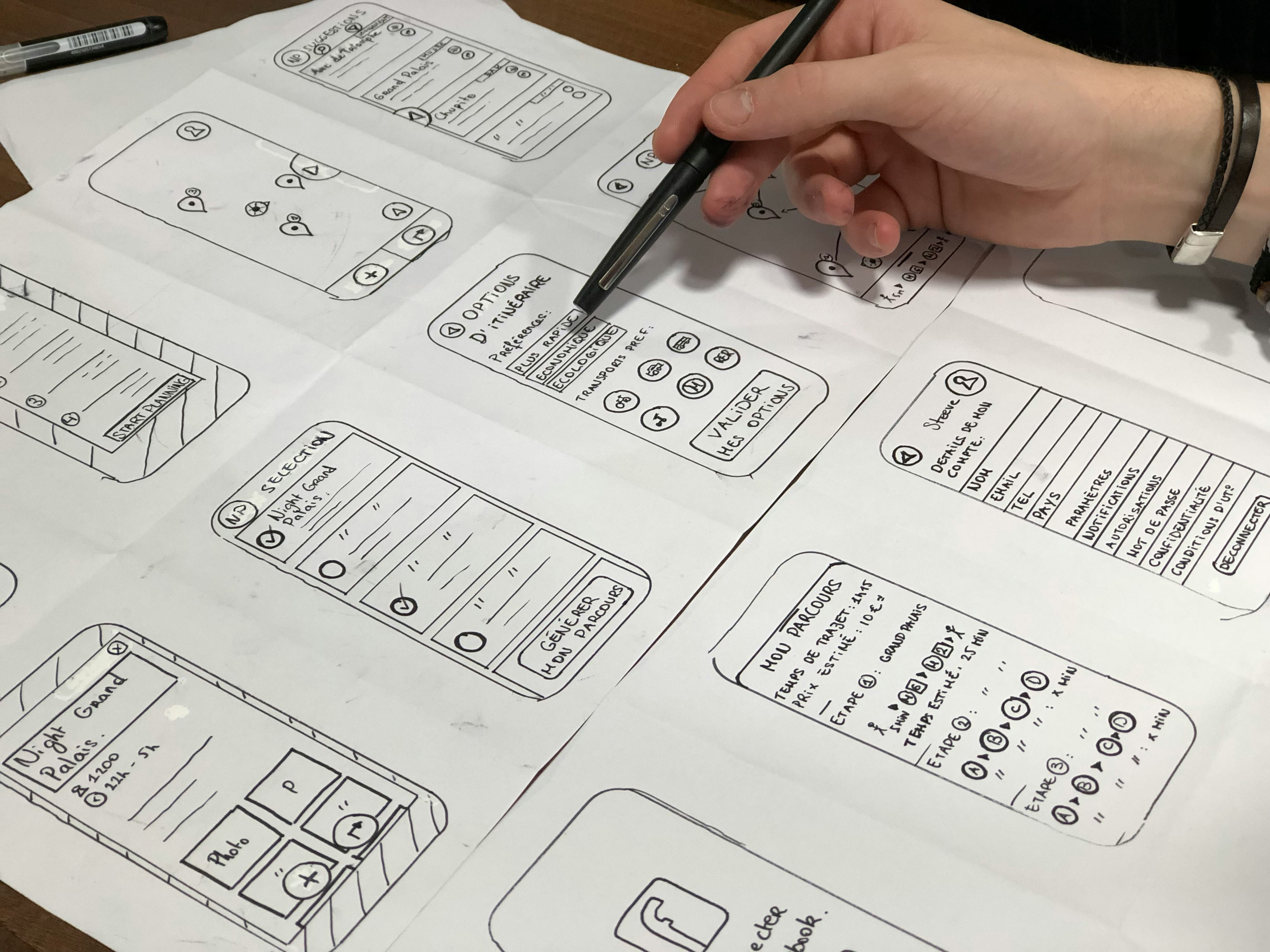
Wireframes for the screens of the app
Building the interactive prototype in Adobe XD
Running the user test with the target group and evaluating the feedback

The user story with its acceptance criteria, developed in a session with the test participants. Click to enlarge.
Decision from it: an apartment is shown with exactly these details, a photo, rooms, size, location, price and a way to make contact.

The user flow of the app, from login through to the favourites list. Click to enlarge.
Decision from it: every filter question comes before the first list of apartments, so shared flat or single, price range, rent with or without utilities plus an explanation, furnished, type and district. After that the student only sees matching apartments.
The prototype shown in a device mockup.
“The app is easy to use because it is built in a straightforward way.”
Feedback from a participant in the user test, translated from German
Conclusion
The user test with people from the target group settled two things. The structure held up: participants found the app easy to use because it is built in a straightforward way. Two details did not hold up. The test showed room for improvement in individual icons and in the swipe gesture, which are exactly the two places where the app tried to work without words. The next step would therefore be to label the icons and to demonstrate the swipe once on the first run instead of assuming it.
What I took away is how much the conversations with the target group changed the result. Running the app in English was not a design decision, it was a survey finding: international students speak English first and learn German later. The same goes for explaining rent with and without utilities, and for the note that unfurnished apartments often have no kitchen. Those points came out of the conversations, not out of the draft.


